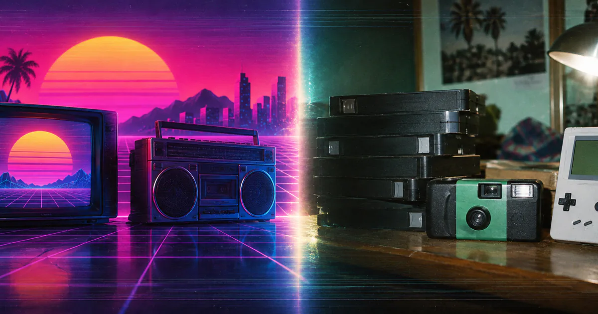
Twenty-six copy-ready retro prompts for ChatGPT Image 2 — neon, disposable-camera flash, VHS, Memphis and arcade pixel art — plus the era cheat sheet and film-stock language that make them land.
AI Magic
Editorial Team
September 11, 202612 min read118views
Most retro prompts fail the same way: they say "80s style" and get a pastiche — neon everywhere, no era discipline, and text that looks like a ransom note. ChatGPT Image 2 changed the second half of that problem, hitting roughly 99% character accuracy on rendered text, which finally makes neon signage, VHS labels and cereal boxes viable. The first half is still on you. Here are 26 prompts that get it right, and the vocabulary behind them.
Why retro works now
ChatGPT Image 2 capabilities that matter for period work
~99%
Text rendering accuracy
Signage and packaging finally work
8
Coherent images per prompt
Ideal for photo strips and sets
2K
Max resolution
Aspect ratios from 3:1 to 1:3
4:3
The most important ratio
CRT and VHS era framing
The six-part retro prompt formula
Every prompt below is built from the same six beats, in this order. Skip one and the image drifts modern:
Subject and action — what is actually happening in frame.
Era anchor — a specific year or narrow window, not "retro". 1984 and 1997 look nothing alike.
Medium and format — 35mm film, Polaroid, VHS still, offset print, CRT screen capture.
Colour and film character — a named stock or a described cast. This does most of the work.
Artifact — the imperfection that sells it: grain, scan lines, date stamp, halftone dots, light leak.
The artifact is the beat people skip, and it is the one that separates a period image from a clean modern photo of period objects. A pristine render of a 1987 living room looks like a furniture catalogue. Add grain, a slight magenta shift and a blown flash highlight, and it looks like someone's mother took it.
The formula, in one line
Subject → Era anchor → Medium → Lighting → Colour and film character → Artifact. Name a specific year rather than a decade, and always finish with the imperfection — grain, scan lines, a date stamp — or the model gives you a clean modern photo of old things.
80s vs 90s: the visual cheat sheet
The single biggest mistake in retro prompting is treating the two decades as one aesthetic. They are close to opposites. The 80s are warm, saturated, hard-lit and deliberately art-directed; the 90s are cooler, greener, flatter and deliberately casual.
Era signatures
What to name in the prompt for each decade
Benchmark
1980s
Warm, staged, saturated
1990s
Cool, candid, muted
Film stock
Kodachrome 64, Ektachrome
Fuji Superia 400, Kodak Gold 200
Colour cast
Warm, magenta shadows
Green-cyan, washed highlights
Lighting
Gelled studio light, practical neon
Direct on-camera flash, harsh falloff
Typography
Chrome, airbrush, laser grids
Grunge, distressed, early web
Props and tech
CRT, boombox, arcade cabinet
Camcorder, Game Boy, CD-ROM
Photo style
Posed studio, soft-focus glamour
Candid snapshot, yearbook
Print texture
Glossy offset, halftone dots
Matte stock, photocopy zine
Film stock and format language
Naming a real stock is the highest-leverage phrase you can put in a retro prompt. The model has learned what these look like, and one stock name replaces a paragraph of colour description.
Stock and format reference
Drop these phrases in verbatim
Benchmark
The look it produces
Best used for
Kodachrome 64
Warm, richly saturated, magenta shadows
80s editorial and family slides
Ektachrome
Cooler, punchy blues, clean whites
80s commercial and travel
Kodak Gold 200
Warm, soft grain, gentle contrast
90s family snapshots
Fuji Superia 400
Green-cyan cast, cooler skin tones
90s candid and youth culture
Polaroid 600
Washed, low contrast, white border
Instant photos, 80s home scenes
Disposable camera flash
Harsh frontal flash, dark falloff, red-eye
90s parties and nightlife
VHS transfer
Soft, bleeding colour, scan lines, tracking noise
Home video and broadcast stills
80s neon and synthwave
The most recognisable 80s register, and the easiest to overdo. Keep the neon as a practical light source in the scene rather than a filter over everything.
Prompt
Synthwave city at night· Prompt 1
A rain-slick city street at night in 1984, viewed down the centre line toward a distant skyline. Neon signage in hot pink and cyan reflects in standing water on the asphalt. Shot on 35mm Kodachrome, wide lens at f/2, practical neon as the only light source with deep unlit shadows between signs. Warm highlights, magenta-shifted blacks, visible film grain, slight halation around the brightest neon tubes. 3:2 aspect ratio.
A roadside American diner at 11pm in 1986, chrome siding and a glowing neon sign reading OPEN ALL NITE in looping red script. Empty parking lot with one parked car. Shot on 35mm Ektachrome, slightly wide, neon and interior window light only, no fill. Saturated cyan sky at last light against warm interior glow, clean whites, fine grain, faint lens flare from the sign. 3:2 aspect ratio.
3. Chrome type hero graphic
A centred chrome logotype reading MIDNIGHT DRIVE in extended 1980s airbrush lettering, polished metal with a magenta-to-cyan gradient reflection. Set against a black background with a receding purple laser grid meeting a low horizon and a large gradient sun. Airbrushed poster illustration, hard specular highlights on the chrome bevels, subtle starburst glints. Offset print texture with faint halftone dots. 3:2 aspect ratio.
4. Laser grid studio portrait
A studio portrait of a person in their twenties in 1987, seated three-quarter to camera in a pastel blazer with shoulder pads. Backdrop is a black field with a magenta laser grid and two blue starburst light effects. Hard key light from camera left with a soft fill, classic mall portrait studio setup. Kodachrome colour, warm skin tones, glossy print finish, slight vignette. 4:5 aspect ratio.
90s disposable camera and film snapshots
This is the decade's defining look and it is almost entirely about the flash. Direct, frontal, unflattering, with everything past two metres falling into darkness.
Prompt
House party direct flash· Prompt 5
A crowded house party in a suburban living room in 1997, four friends mid-laugh crammed into frame, one holding a plastic cup. Shot on a disposable camera with harsh direct on-camera flash, blown highlights on the nearest faces, background falling into near-black two metres back. Fuji Superia 400 colour with a green-cyan cast, heavy grain, slight red-eye, soft focus at the edges, tilted handheld framing. 3:2 aspect ratio.
Two kids running through a garden sprinkler in a suburban backyard in 1994, mid-afternoon, chain-link fence and a beige bungalow behind. Shot on 35mm Kodak Gold 200 with available light, slightly overexposed, soft warm grain. Gentle contrast, faded greens, warm highlights, a small light leak in the top right corner and a faint orange date stamp reading 07 21 94 in the lower right. 3:2 aspect ratio.
7. Mall food court candid
A shopping mall food court in 1995, two teenagers at a moulded plastic table with paper cups, mid-conversation, unaware of the camera. Fluorescent ceiling light mixed with skylight, pastel tile and potted palms behind. Shot on Fuji Superia 400, candid snapshot framing slightly off-level, cool green cast, flat contrast, visible grain, mild motion blur on a passing shopper. 3:2 aspect ratio.
8. Road trip car interior
The interior of a moving car on a highway at golden hour in 1996, shot from the back seat toward the driver and passenger, one arm out of the open window. Available light only, sun flaring through the windscreen. Shot on Kodak Gold 200, warm heavy grain, blown highlights in the sky, dusty windscreen, slight handheld tilt and a soft light leak down the left edge. 3:2 aspect ratio.
Template
Disposable Camera· The 90s snapshot look, one click
Render your photo in the unmistakable look of a 1990s disposable film camera — slight overexposure, warm yellow cast, soft grain, harsh on-camera flash with red-eye potential, and the imperfect but emotionally honest framing of pre-smartphone candids.
This is where ChatGPT Image 2's text rendering earns its keep. Period advertising is mostly typography, and a model that can actually spell makes these viable for the first time.
Prompt
80s soda magazine ad· Prompt 9
A full-page 1985 magazine advertisement for a fictional citrus soda called SUNBURST. A frosted aluminium can centred on a gradient background running from hot orange to deep magenta, condensation beads catching hard studio light, ice cubes and an orange wedge arranged at the base. Bold extended sans-serif headline above reading TASTE THE HEAT, small body copy block beneath. Airbrushed commercial illustration style, glossy offset print with fine halftone texture and slight ink misregistration at the edges. 4:5 aspect ratio.
A front-facing 1993 breakfast cereal box for a fictional brand called COSMIC CRUNCH, photographed flat against white. Bright primary colours, a cartoon astronaut mascot mid-leap, bubble lettering with a heavy drop shadow, a starburst badge in the corner reading FREE TOY INSIDE. Matte carton stock with visible print dot texture and slight corner wear. Even frontal product lighting, no perspective distortion. 4:5 aspect ratio.
11. 80s electronics catalogue spread
A 1987 consumer electronics catalogue page laid out in a grid of six products: a boombox, a portable cassette player, a CRT television, a corded telephone, a calculator watch and a hi-fi receiver. Each shot on clean white with hard product lighting and a small price flag and spec line beneath. Headline across the top reading HOME ENTERTAINMENT. Glossy offset print, saturated Ektachrome colour, fine halftone screen, slight paper texture. 4:5 aspect ratio.
12. 90s sneaker poster
A 1996 athletic shoe poster, a single high-top sneaker floating three-quarter view against a concrete texture background with bold diagonal colour blocks in teal, purple and orange. Distressed grunge type at an angle reading NO LIMITS, small logo lockup bottom right. Hard directional studio light with a crisp cast shadow. Matte print finish, slight photocopy grain over the background, saturated but cool colour. 4:5 aspect ratio.
80s and 90s portraits
Portraits are where era discipline matters most, because hair, lighting and film character all have to agree. Name the year and let the rest follow.
13. 80s glamour studio portrait
A soft-focus studio glamour portrait of a woman in 1985, shoulders angled away, chin turned to camera, voluminous feathered hair, pastel off-shoulder top. Soft key light with a heavy diffusion filter and a warm hair light from behind, graduated blue-to-pink backdrop. Kodachrome colour with warm skin tones, glowing highlights, dreamy halation around the light sources, glossy print finish. 4:5 aspect ratio.
14. 90s yearbook portrait
A high school yearbook portrait from 1996, a teenager seated square to camera in a plain collared shirt, polite closed-mouth smile, curtained hair. Mottled blue-grey studio backdrop, standard two-light school photography setup with a soft key and weak fill. Kodak Gold colour, slightly flat contrast, mild grain, glossy small-print finish with a faint white border. 4:5 aspect ratio.
15. 80s band promo photo
A four-piece band promotional photograph from 1988, all members standing in a tight staggered line against a graffiti-covered brick wall, arms crossed, deliberately unsmiling. Leather jackets, big hair, one pair of mirrored sunglasses. Hard flash with a coloured gel throwing magenta onto the wall, deep shadows. Shot on 35mm, saturated, contrasty, visible grain, slight print colour shift toward cyan. 3:2 aspect ratio.
16. 90s grunge editorial portrait
An editorial portrait of a musician in 1994, seated on a worn couch in a dim rehearsal space, flannel shirt, unkempt hair, looking away from camera. Single window as the only light source, heavy shadow across one side of the face. Shot on Fuji Superia 400, cool green cast, muted desaturated palette, heavy grain, slightly underexposed with crushed blacks. 4:5 aspect ratio.
VHS, CRT and broadcast artifacts
The trick here is committing to the format's flaws. Ask for scan lines, tracking noise and interlacing explicitly, and shoot 4:3.
Prompt
VHS home video still· Prompt 17
A freeze-frame from a home video recorded in 1991: a family birthday party in a beige dining room, a child leaning toward a lit cake, adults blurred behind. Camcorder light mounted on the camera as the main source, harsh and frontal. VHS tape transfer look with soft resolution, bleeding red and orange, visible horizontal scan lines, mild tracking distortion along the bottom edge, interlacing on moving hands. Blue timestamp in the lower right reading 11 03 1991 8 42 PM. 4:3 aspect ratio.
A freeze-frame from a 1986 television commercial for a household cleaning product: a smiling actor in a bright pastel kitchen holding the bottle toward camera. Flat high-key three-point studio lighting, no shadows. Broadcast video look with soft edges, slightly blown highlights, oversaturated pastels and a white product superimposed in the lower third with a price flash. Visible scan lines and mild chroma bleed. 4:3 aspect ratio.
19. 90s news broadcast still
A still from a 1997 local television news broadcast: an anchor at a desk in a blue and grey studio set, city skyline graphic behind. Flat even studio lighting. Chyron lower-third graphic bar in blue and white with a bevelled edge reading LIVE AT FIVE, a small station logo bug in the top right corner. Broadcast video softness, slight interlacing, muted colour, visible scan lines. 4:3 aspect ratio.
20. Camcorder night footage
A frame from handheld camcorder footage at night in 1995, filming a suburban street from a moving car window, streetlights streaking past. Camcorder auto-exposure struggling, heavy video noise in the shadows, smeared highlights around each streetlight. Low resolution, chroma noise, motion smear, visible tracking lines. Yellow timestamp in the lower right reading AUG 14 1995 22 17. 4:3 aspect ratio.
Arcade, gaming and pixel art
Pixel art needs an explicit resolution and palette constraint, otherwise the model produces a smooth illustration wearing a pixel costume.
21. Arcade cabinet row
A row of six upright arcade cabinets in a dim arcade in 1989, seen at a three-quarter angle receding down the aisle, side art glowing under blacklight, CRT screens lit with attract-mode graphics. Carpet with a geometric neon pattern. Practical light from the screens and marquee lamps only. Shot on 35mm Kodachrome at f/2, deep shadows, saturated magenta and cyan, heavy grain, slight halation from the marquees. 3:2 aspect ratio.
22. 8-bit pixel art scene
A side-scrolling platformer scene rendered as authentic 8-bit pixel art at 256 by 224 resolution, restricted to a 16-colour palette. A small sprite character mid-jump between floating brick platforms, a parallax mountain layer behind, scattered cloud sprites. Hard pixel edges with no anti-aliasing, dithered gradients in the sky, black outlines on foreground tiles. Presented at 4:3 with visible square pixels.
23. 16-bit RPG menu screen
A 16-bit console role-playing game menu screen from 1994, rendered at 320 by 224 resolution. A blue bevelled dialogue box with a white border occupies the lower third, containing crisp pixel text reading ITEMS, MAGIC, EQUIP and STATUS in a stacked list with a small arrow cursor. Behind it, a pixel-art overworld map with tile-based grass, forest and a coastline. Limited palette, dithered shading, hard pixel edges, no anti-aliasing. 4:3 aspect ratio.
Reduce your photo to crisp 8-bit pixel art in the visual language of NES, SNES, and Game Boy classics. Limited palette, clean pixel edges, exaggerated proportions, and the unmistakable retro-game-sprite aesthetic that triggers instant nostalgia in anyone who grew up gaming.
The decade's design languages are distinct enough to name directly, and the model responds well to movement names.
24. Memphis Milano poster
A 1988 design poster in the Memphis Milano style: flat geometric shapes in mint, coral, black and yellow scattered asymmetrically across a cream background, squiggle motifs, confetti speckle pattern, a black and white checkerboard band and a large circle in terracotta. Bold condensed sans-serif headline reading DESIGN FORUM 88 set at a slight angle. Flat vector illustration, no gradients, offset print texture with subtle paper grain. 4:5 aspect ratio.
25. Grunge zine spread
A two-page 1995 music zine spread, photocopied and hand-assembled. Torn paper edges, high-contrast black and white photocopied band photograph bleeding off the left page, typewriter body text in uneven columns, hand-scrawled marker annotations, a strip of adhesive tape across one corner. Distressed ransom-note headline reading NOISE FLOOR. Xerox grain, blown blacks, dust and scratch artifacts, slight page skew. 3:2 aspect ratio.
26. Windows 95 desktop
A 1996 desktop computer screen capture at 640 by 480 resolution showing a grey operating system interface with bevelled window chrome. Two overlapping windows with blue title bars, a file manager with small pixel icons in a list, a taskbar along the bottom with a start button and clock reading 3 47 PM, and a teal background pattern. Crisp pixel-aligned UI, bitmap system font, no anti-aliasing, faint CRT scan lines and slight screen curvature at the corners. 4:3 aspect ratio.
Getting the text right
Period design is typography-heavy, and this is the capability that changed most. To get clean rendered text out of ChatGPT Image 2, three habits help:
Put the exact string in capitals inside the prompt and say where it sits — "a neon sign reading OPEN ALL NITE in looping red script". Ambiguity about the words is what produces gibberish.
Keep strings short. A headline and a badge render reliably; a full paragraph of body copy is better described as "a small block of body copy" and left illegible, which is also more period-accurate at small sizes.
Name the lettering style — chrome airbrush, bubble lettering, bitmap system font, ransom-note collage. The typeface era is as much a period signal as the film stock.
The model's batch coherence is useful here too. Because it can hold characters and objects consistent across up to eight images in one request, you can ask for a set — four frames of the same photo strip, or a three-page catalogue spread — instead of generating and re-matching separately.
Run the same prompts somewhere else too
These prompts are written for ChatGPT Image 2 but the vocabulary is portable — film stocks, artifacts and era anchors work across models. OpenArt is useful for running one prompt across several models at once and picking the best frame.
Mistakes that break the retro look
Saying "80s" or "retro" instead of a year. A decade is an average; 1981 and 1989 are different worlds. Anchor to a year.
Stacking every era cue at once. Neon plus VHS plus Memphis plus grunge produces mush. Pick one register per image.
Forgetting the aspect ratio. Anything screen-based wants 4:3. Film photography wants 3:2. A 16:9 VHS still is instantly wrong.
Omitting the artifact. No grain, no scan lines, no date stamp means a clean modern photograph of vintage props.
Over-describing colour. One named film stock beats four sentences about warmth and saturation, and conflicts less.
Modern faces and teeth. If people look contemporary, add era-specific hair, eyewear and grooming — it is usually the hair that gives it away.
Adapting these to your own work
Treat each prompt as four swappable slots: the subject, the year, the film stock or format, and the artifact. Keep the structure and the lighting language intact, because that is what is doing the work.
For brand use, the highest-value application is the product-ad set — swap the fictional brand for your own, keep the period layout conventions, and you get campaign creative that reads as genuine period advertising rather than a filter applied to a modern photo. Start from prompt 9 or 12 and change only the product noun and the headline string.
About these prompts
Written against ChatGPT Image 2 (ChatGPT Images 2.0, released April 2026) and its documented capabilities — roughly 99% text-rendering accuracy, 2K output, aspect ratios from 3:1 to 1:3, and up to eight coherent images per request. Output varies between runs; treat each prompt as a starting point to iterate on. Brand names used in the ad prompts are fictional and included as placeholders to swap for your own. Disclosure: the OpenArt link is an affiliate link.
Frequently Asked Questions
8 questions answered
Use six beats in order: subject, era anchor, medium, lighting, colour and film character, then artifact. The artifact — grain, scan lines, a date stamp, a light leak — is the beat most people skip, and it is what separates a period photograph from a clean modern photo of vintage props.
Name a specific year and use era-correct film language. The 80s are warm and saturated — Kodachrome, gelled studio light, posed framing. The 90s are cool and flat — Fuji Superia, direct on-camera flash, candid snapshot framing. Mixing the two is the most common reason retro prompts read as generic pastiche.
Yes — it reaches roughly 99% character-level accuracy, including non-Latin scripts, which is a large jump over earlier models. Put the exact string in capitals in your prompt, say where it sits in the frame, and keep it short. Long body copy is better left described as an illegible text block.
4:3 for anything screen-based — VHS stills, CRT captures, broadcast frames, pixel art. 3:2 for 35mm film photography, and 4:5 for portraits, posters and magazine pages. ChatGPT Image 2 supports ratios from 3:1 to 1:3, and a widescreen VHS still reads as wrong immediately.
You are probably missing the flash and the grain. The 90s snapshot look is built on harsh direct on-camera flash with blown near-highlights and a background falling to near-black about two metres in, plus heavy grain and a green-cyan cast from Fuji Superia. Ask for all three explicitly.
Constrain it numerically. Specify a resolution such as 256 by 224, a palette limit like 16 colours, hard pixel edges and no anti-aliasing. Without those constraints the model produces a smooth illustration that merely resembles pixel art rather than genuine tile-based sprite work.
Yes. ChatGPT Image 2 can produce up to eight coherent images from a single prompt with character and object continuity across the batch. That makes it well suited to photo strips, contact sheets, multi-page catalogue spreads and campaign sets that need the same subject in every frame.
The prompts themselves are free to use and adapt. Check your image generator's current terms for commercial rights on output, and note that the brand names in the advertising prompts are fictional placeholders — swap them for your own rather than generating imagery that imitates a real company's branding.